pauseproject.net & @pause.project
Wurundjeri Country

Pause Projects is a collaborative passion-project turned creative platform created by Gita Zimmermann and designer Jacob L’Huillier Lunt. The duo have been working on the project since the first long lockdown in 2020.
Pause uses visual language to process mass information and themes of this unusual period, holding space for both artist and audience to pause and reflect.
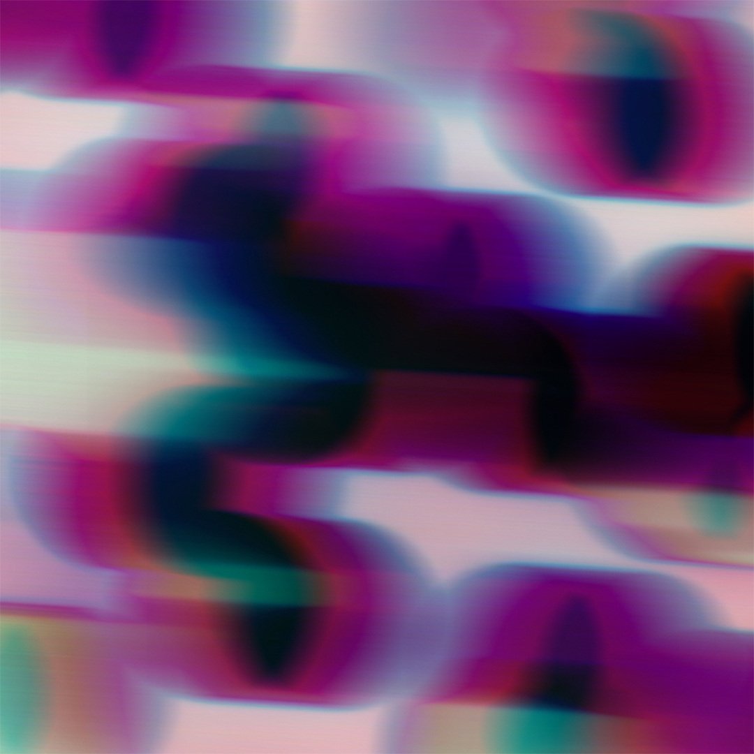
Unsettled1, 2021
How did the project come to be?
We were both feeling overwhelmed by negative news and media, regarding COVID-19 and world events, and wanted to channel these emotions using designs into emotive works that explored our own interpretations of themes/moods we had picked up were prevalent in the community, specifically in Naarm (Melbourne).
Our approach was to, without words, use visual language (colour, shape, movement) to explore the words we felt had summed up 2020 at the time, which were 'Time', 'Comfort', 'Overwhelm', 'Curfew', 'Frustration' and 'Respite', resulting in two interpretations from both of us in 12 digital works.

Tell us about how this project has developed?
With these works, we wanted to generate a way the audience could engage with our project, and in doing so, we released a set of postcards that people could send to people that had made a difference to their 2020, and perhaps address some of these themes. Later we produced a 2021 Calendar, with segments of the works, hoping to create something of depth out of the year that was quite a difficult one for most.
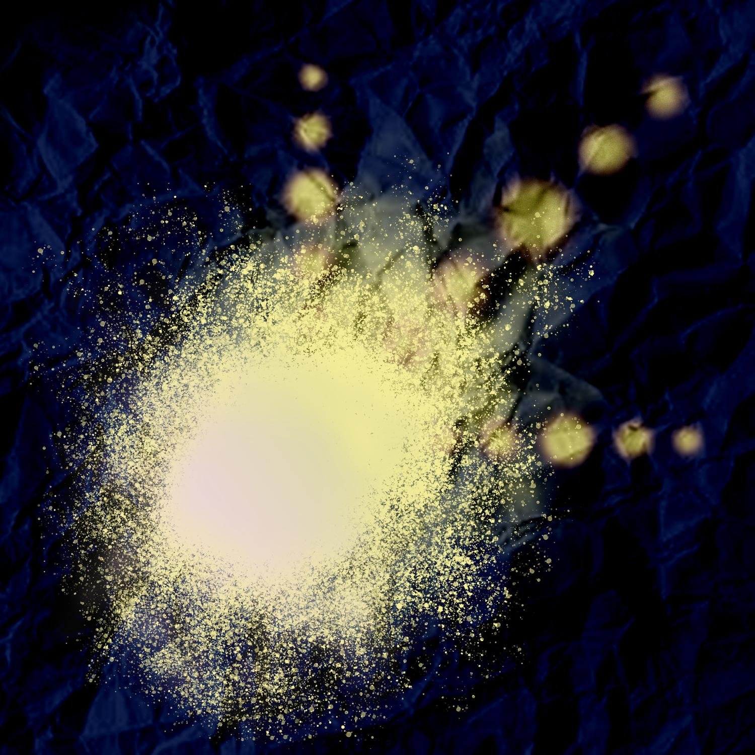
Growing2, 2021

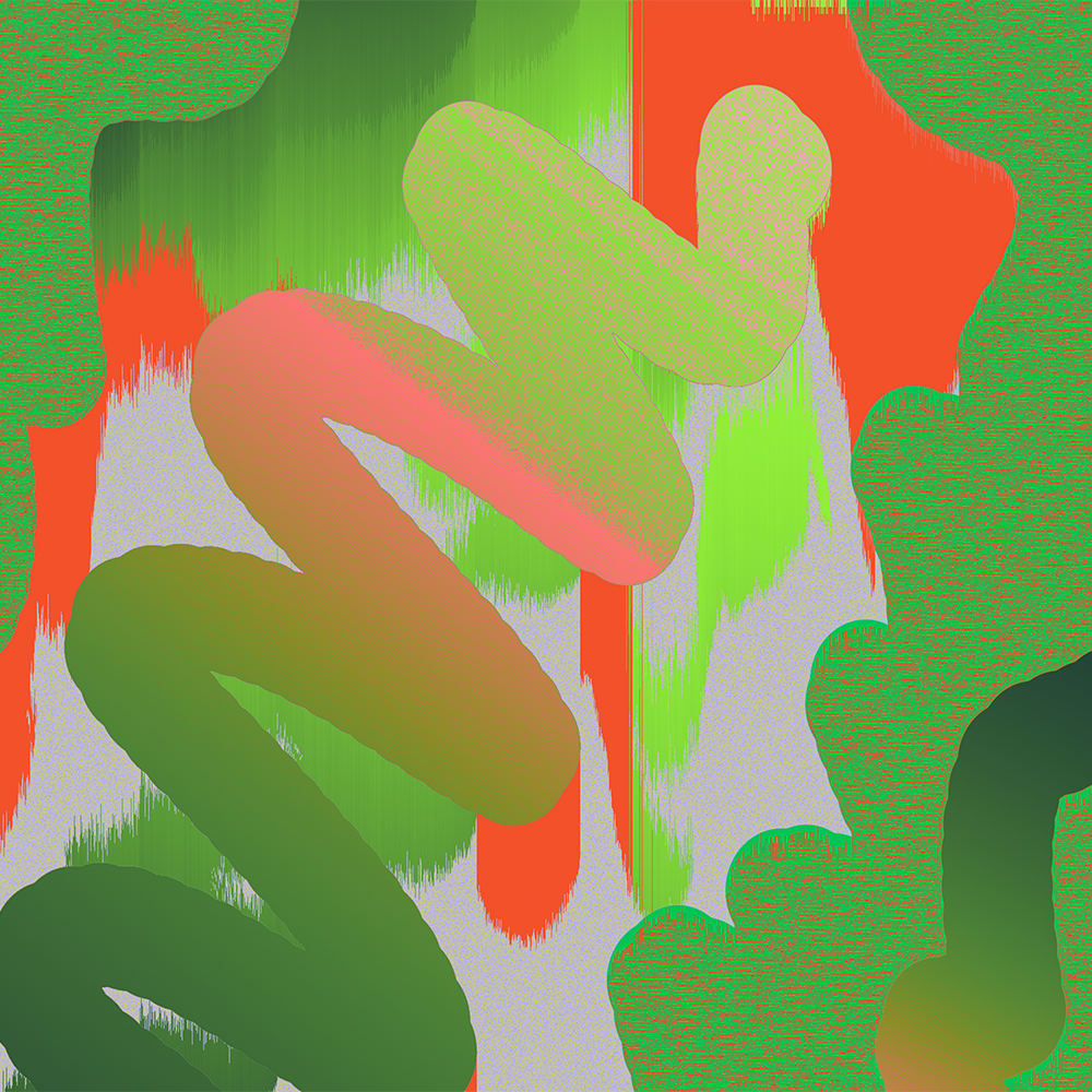
Solitary1, 2021
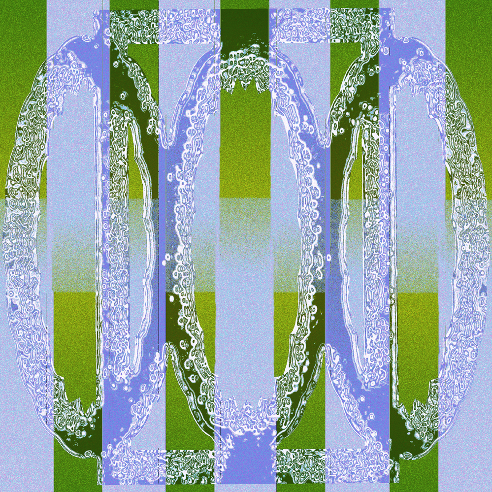
New1, 2021

At about the year mark of initially creating the works, we aimed to generate another 6 words we felt summed up the slightly different experience of 2021, one year into the pandemic. We engaged with our social media audience, as well as people in our lives in Naarm, to ascertain some themes that felt prevalent to the community experience this year. The resulting works, again with each of our interpretations, felt like they reached a little deeper into the community and resulted in the works 'New (1,2)', 'Growing (1,2)', 'Unsettled (1, 2) 'Accepting (1, 2), 'Solitary (1, 2)' and 'Repeat (1,2)'. Our process was to try pause and sit with these emotions and see where it led us without feeling we needed to achieve a certain aesthetic - which allowed us both to explore our inner worlds and styles as designers in approaching the same words.
Accepting2, 2021
Where can we see more of your work?
Our works can be viewed at our (new!) website over at: pauseproject.net or as well as our Instagram @pause___project.
And what's next for you?
We have just released prints for the first time, and working on some collaborations with other artists, and clients where we can try to use a similar approach we have for our works. We especially love working with things that engage our senses, and require a strong visual that connects to an emotional outcome or process.


